Problem: The Department of Energy's website is too cluttered, making it difficult for users to find essential energy-saving tips.
Solution: Simplify the website layout to make navigation easier for users and create a dedicated section for energy-saving tips.
Impact: The redesign made energy-saving information 20% easier to access.
Role: UI Design (Individual Project)
Tools: Figma, FigJam, Google Drive
Original Web page
Redesigned Web page
The Department of Energy website offers useful energy-saving tips, but users struggled with the "Save Time, Save Money" section, its categories, and the email sign-up process. I redesigned the site to improve navigation and simplify email sign-ups. Balancing usability with an appealing design was crucial.
Challenges:
Research
Where the journey started
To tackle user experience research, we started by understanding the user’s needs through 10 interviews and observations. I analyzed the data to identify pain points and design solutions that enhance usability and satisfaction.
What our users shared
Looking at the current system
The homepage is overloaded with content and numerous elements, creating a cluttered experience. This abundance of information makes it challenging for users to quickly locate the most relevant or important details.
Energy Tips section
This section was great for a wide audience but several content was buried deep in the site. After a quick usability check, I found several navigation issues that could keep users from finding the content they were looking for. Users also struggled to find correct links to the sealing windows guide.
Key user frustrations
Define
Meet Sarah!
Sarah was created to represent environmental consultants who need quick, reliable access to energy-saving tips to support their work and make informed recommendations efficiently.
How can we improve Sarah’s journey?
Feature Prioritization Matrix
I picked simplifying navigation as the top priority because it helps users find what they need faster and with less hassle. A clear, easy-to-use layout makes the whole experience better.
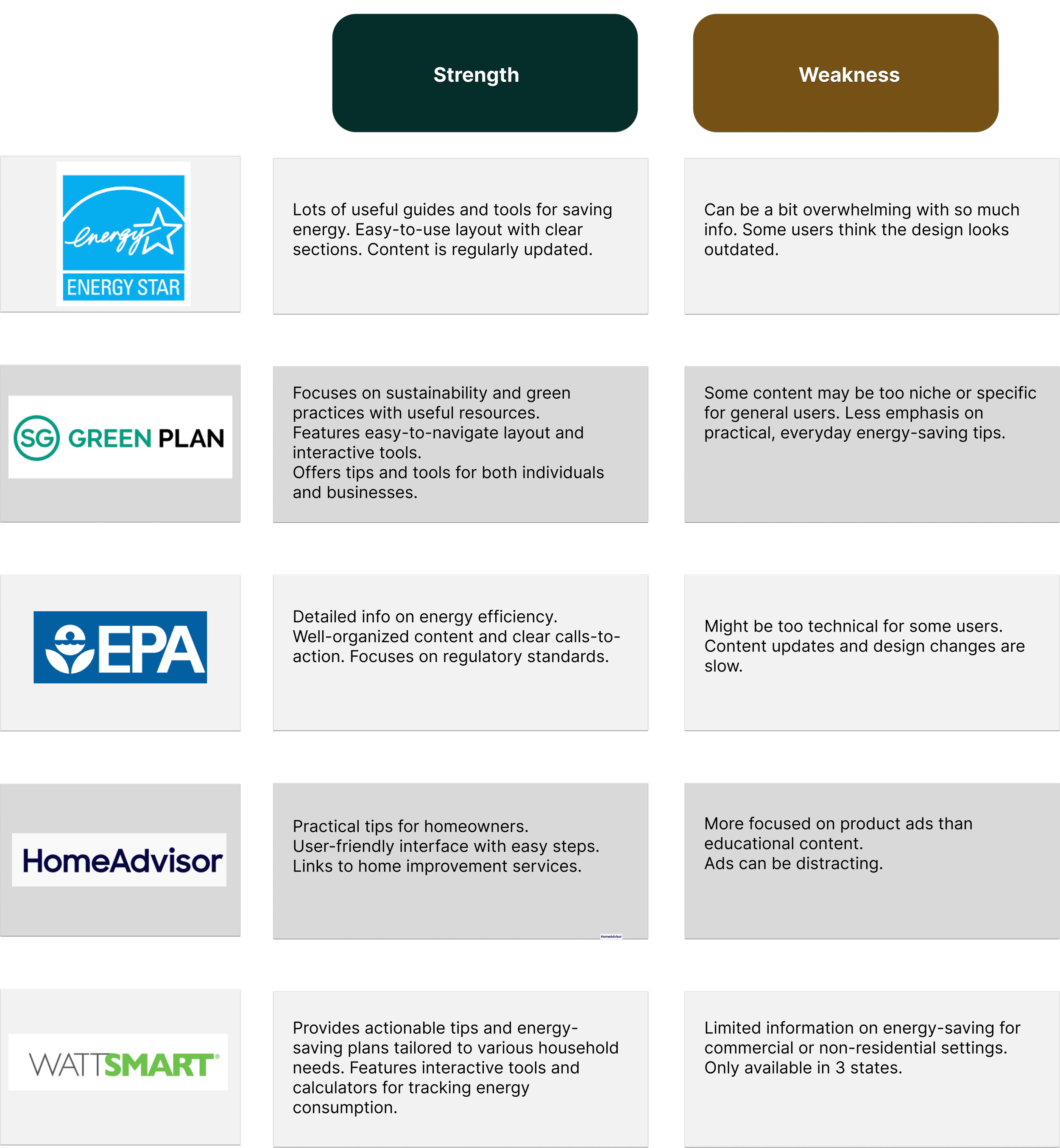
Competitor Analysis
I chose these competitors to analyze because they represent a range of approaches to energy-saving resources, from personalized tips to interactive tools, offering valuable insights into what works and what can be improved in the field.
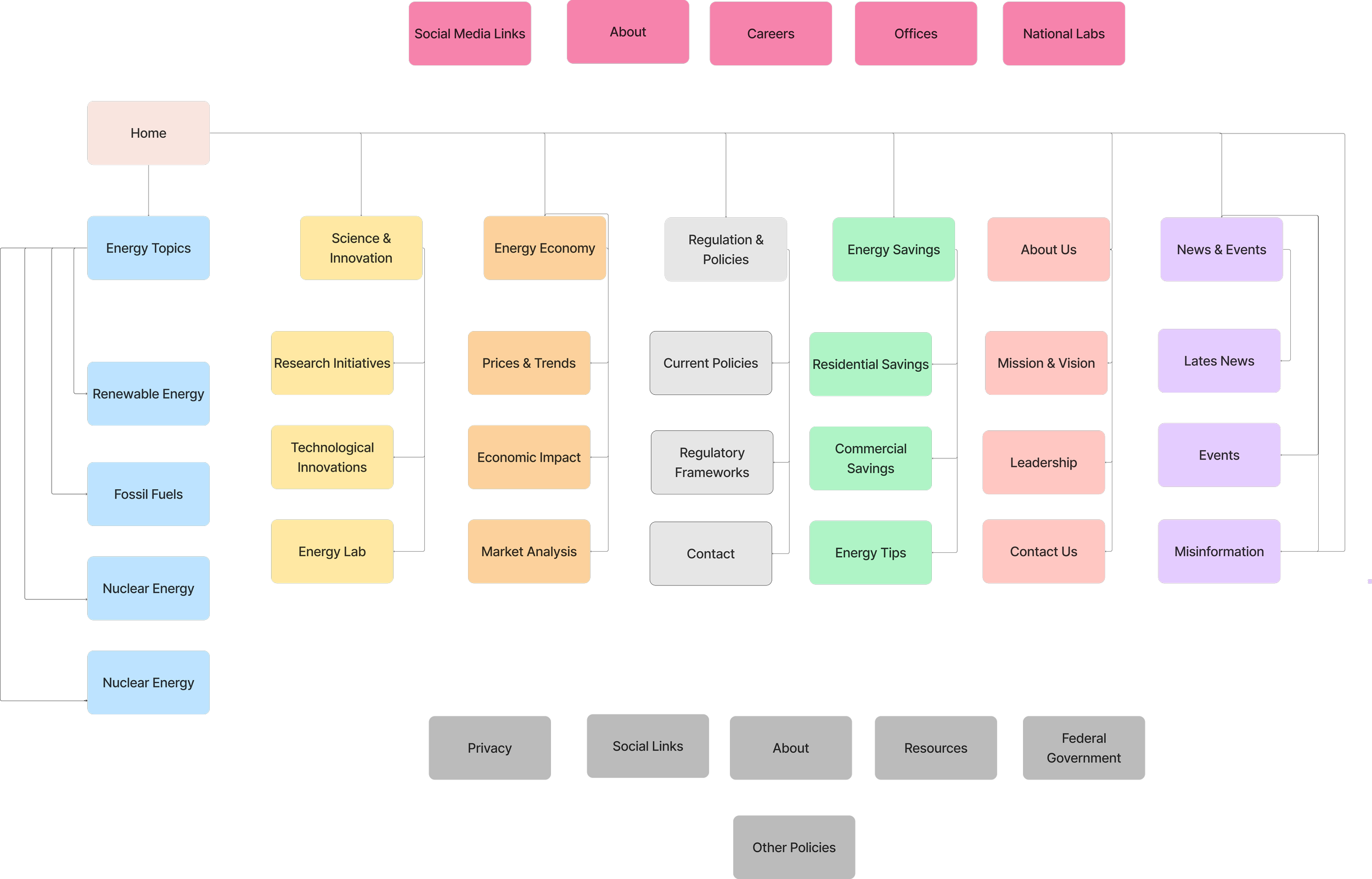
Old Sitemap
New Sitemap
Journey Map
I created this journey map to show Sarah's struggles in finding reliable energy-saving tips online and to identify ways to improve the search process for better user support.
I simplified the Department of Energy navigation by condensing it into fewer, more focused sections so users could find important info without digging through endless menus. I chose this approach to reduce clutter and make the experience more intuitive, helping users get to what they need with less effort.
Design
Now that I saw where the design was going, I created a mood board focused on green to highlight eco-friendliness and align with the energy-saving theme of the redesign.
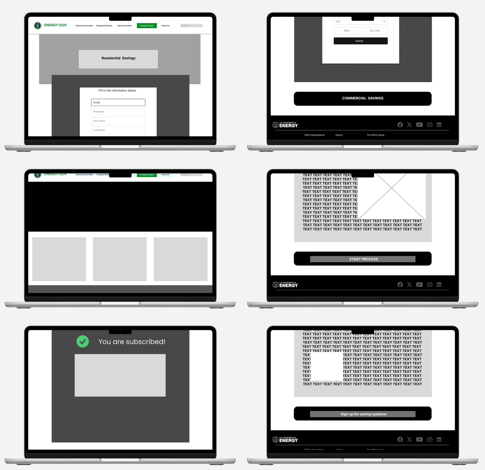
I began wireframing by sketching out basic layouts to establish a clear structure and flow for the redesigned website and mobile version .
01. Less clicks:
Wireframed with the goal of guiding users naturally to important sections, minimizing clicks to find what they need.
02. Balancing Design:
For desktop, I worked on making the most of the extra space without overcrowding it, ensuring a consistent look across both versions while keeping things user-friendly.
03. Refining with Feedback:
User feedback helped me identify areas to improve, so I tweaked the navigation and content organization, making sure everything aligned with the design goals and was ready for the next phase.
Mobile & Web (Mid-fidelity) Wireflow
1st Style Guide
2nd Style Guide (Final)
I designed Sarah's storyboard with her busy life in mind. As an environmental consultant, she needs quick access to energy-saving tips without the frustration. I aimed to make info easy to find in just a few taps, helping her feel confident and empowered to make an impact
Storyboard
Feedback
Recieved mostly positive feedback from the mid-high fidelity design. Now it was time to do one final iterations and clean up the design.
Testing
I tested the redesign by having users try it out once again, asking them to navigate the site, find specific info, and sign up for updates. I then gathered their feedback to see what worked and what needed fixing.
Original (Before)
The initial test was done on the original Department of Energy website, where users struggled with confusing navigation and couldn’t find what they needed, leading to frustration.
First test (Low-fidelity Prototype)
The second test on the low-fidelity redesign revealed issues with unresponsive buttons, warped text boxes, forms not submitting and navigation sliding upward.
Final Design (Web)
Final Design (Mobile)
We revamped the navigation for the Department of Energy website based on user feedback, trimming down unnecessary sections and easier to locate the savings page. Now, it’s much easier for users to find the information they need without feeling overwhelmed!
Next steps
Future teams can improve this project by regularly gathering user feedback to spot areas for growth. Teams can focus on testing site performance and finding more ways to simplify the user experience. Adding fresh content will also help keep users engaged. Staying connected with the audience and adapting to their needs will keep the site evolving and user-friendly.
Learning 01: Listen to Users
We discovered just how powerful user feedback can be. By reaching out and genuinely listening to what users had to say, we uncovered real frustrations and confusion that we hadn’t noticed before. It felt rewarding to make design choices that directly addressed their needs, creating a more enjoyable experience for everyone.
Learning 02: Make It Accessible
We really felt the impact of making our design accessible. It’s not just about compliance; it’s about ensuring that everyone, regardless of their abilities, can navigate the site easily. Knowing that our efforts could help someone access vital information and resources made the work feel meaningful. It reinforced our commitment to inclusivity and serving our community.
Learning 03: Keep It Simple
We learned that simplicity is key. By streamlining the navigation and focusing on what users truly need, we transformed the experience from overwhelming to refreshing. It was exciting to see how much happier users were when they could find information without hassle. This journey reminded us that clarity and ease can make all the difference in keeping users engaged and satisfied.


