Problem: Users with disabilities struggle to find accessible and attainable job opportunities.
Solution: The Easter Seals website will connect people of all abilities to employers with a user-friendly platform.
Impact: 1 in 4 adults have a disability. Our redesign aimed to reach this 25%, achieving a 42% usability increase through iterations.
Role: Research & UX/UI Design
Tools: Figma, FigJam, Google Drive, Google slides
Original Web page
Redesigned Web page
Redesigning the Easter Seals Mahoning website required addressing accessibility challenges, such as ensuring color contrast, simplifying navigation, and optimizing the job search. Balancing these needs while maintaining an appealing design was key.
Challenges:
Research
Where the journey started
To tackle user experience research, we started by understanding the user’s needs using 7 interviews, 5 surveys, and observations. We analyzed the data to identify pain points and design solutions that improve ease of use and overall functionality.
What our users shared
Navigating through the Website
User clicks on the 'Our Programs' menu to explore available work options, browsing through different categories and services that align with their skills and interests.
Looking at the current system
Work Options
A few list of job services available and only accessible by emailing case management. There is no apllication form.
Empathy Map
The empathy map was built by capturing the thoughts feelings, and concerns of people with disabilites and parents of children with disabilites who face challenges in finding jobs.
Key user frustrations
Define
Meet the power mom!
Rose, our user persona was created to amplify the experiences and needs of parents with children who have disabilities, ensuring their voices are heard and represented. Rose was inspired by one of our interviewes!
How can we improve Rose’s journey?
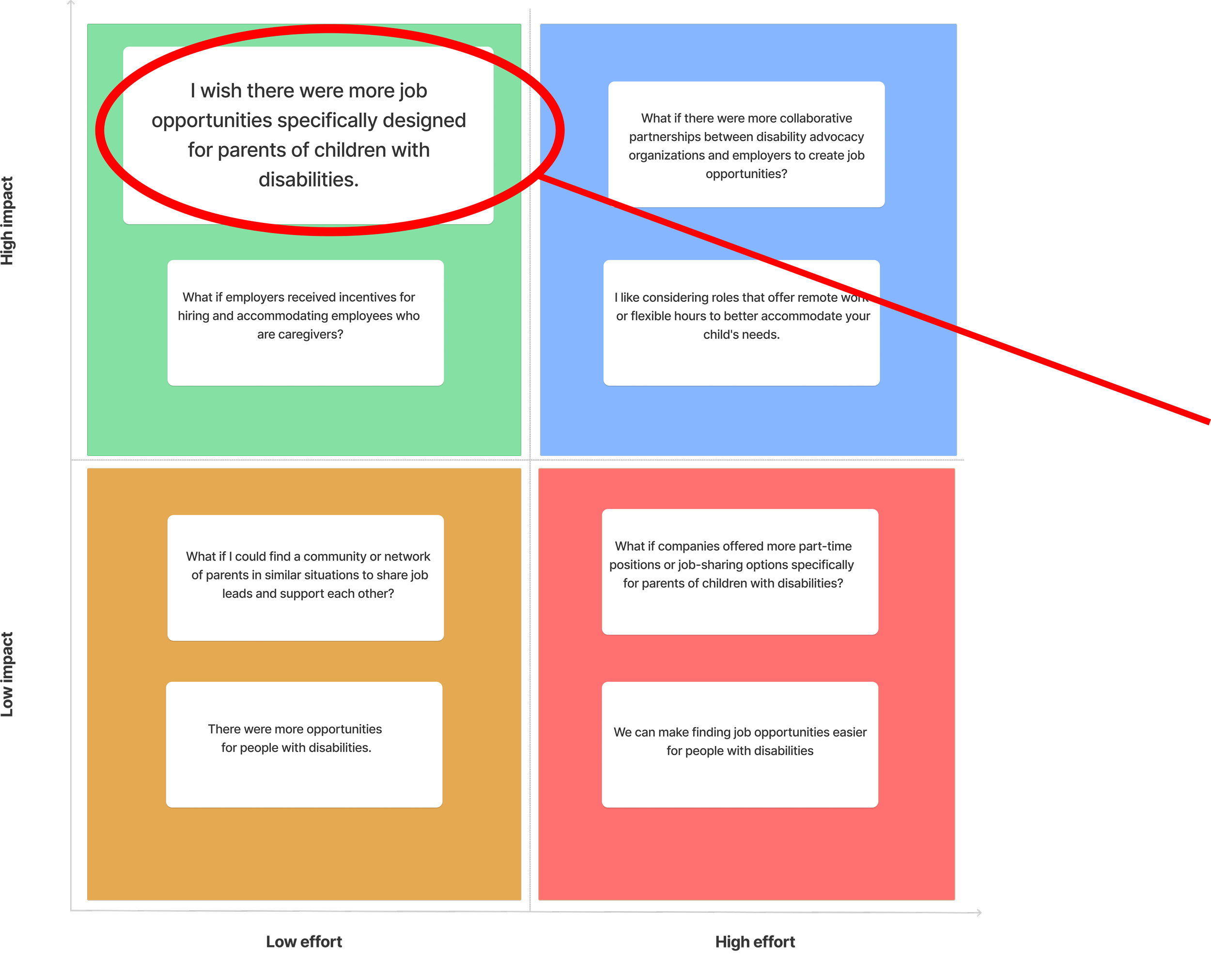
Feature Priortization Matrix
I chose this focus for the feature prioritzation matrix to enhance collaboration between advocacy groups and employers, creating more job opportunites for people with disabilites.
Competitor Analysis
I focused on competitors with strong accessibility, community engagement, and non-profit advocacy to guide the Easter Seals redesign. These organizations excel in user-friendly design, offering insights to improve Easter Seals' ease of use and user experience.
Old Sitemap
New Sitemap
Journey Map
Based on the data above, I created a new system. In the old system, the process was longer, and you were always waiting for a response. The new system is faster and can automate responses while allowing you to apply for other jobs.
7 steps
6 steps
I created a journey map for Rose to really show the frustrations and obstacles parents of kids with disabilities face when looking for jobs. I wanted to dig deeper to get a better feel for what she’s going through, so I could see things from her perspective and find ways to support her better.
Design
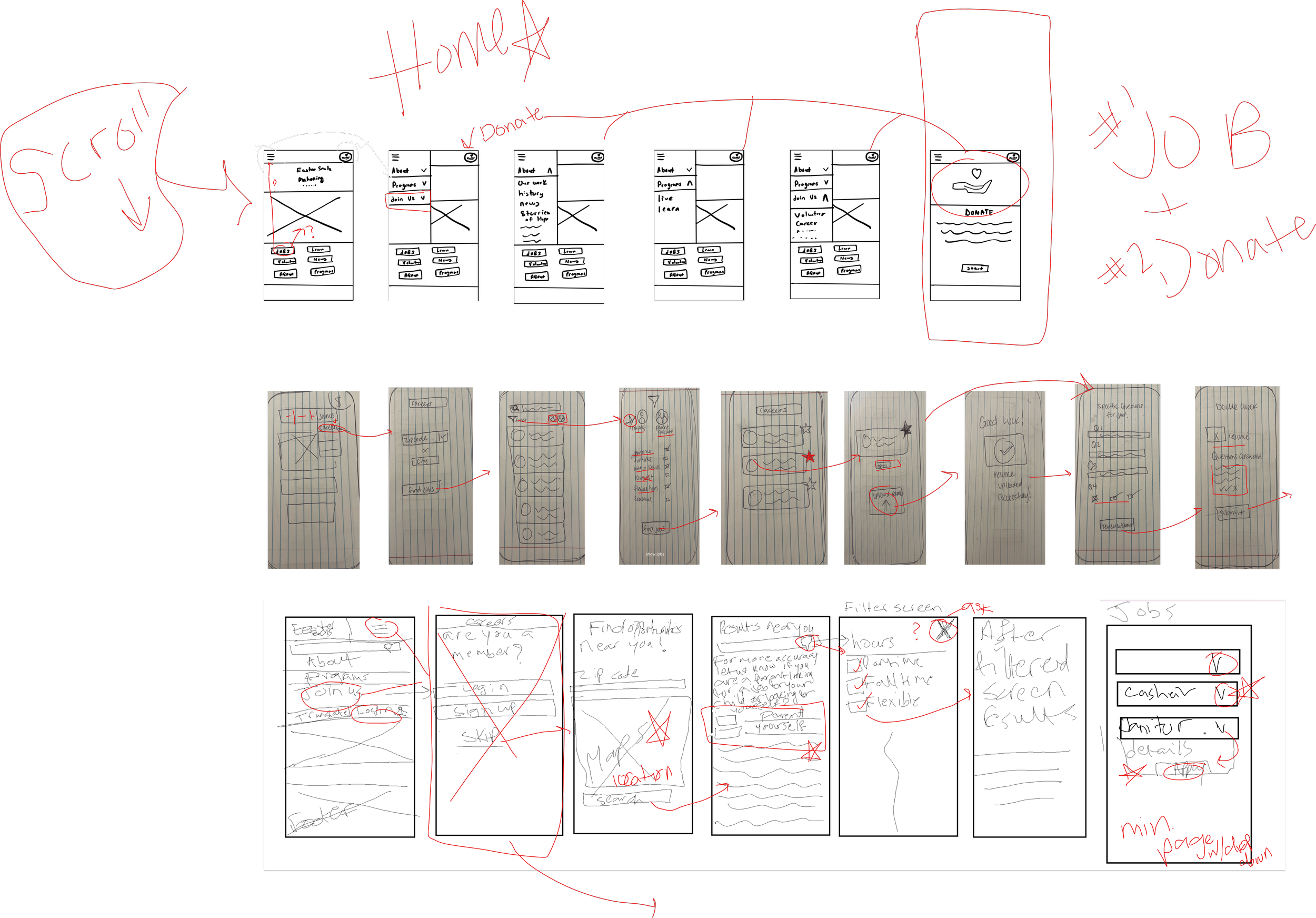
We started our design process by creating wireframes for mobile initially, but later switched to desktop based on user feedback, as they found it easier to apply on desktop.
1st Style Guide
2nd Style Guide (Revised/Not Final)
Heuristic Evaluation
Right after we created our wireflow, we began to create our final style guide and this is where we messed up.
We developed a style guide for the Easter Seals website, but the team's original and secondary orange did not pass accessibility tests.
Final Style Guide
After a heuristic evaluation, I chose a warm yellow and dark purple, both of which passed accessibility. These colors were selected for their calming yet joyful effect and was well recieved after user testing.
Story Board
I created the storyboard to show how Easter Seals improved Rose’s experience by offereing an accessible and successful job search for the child.
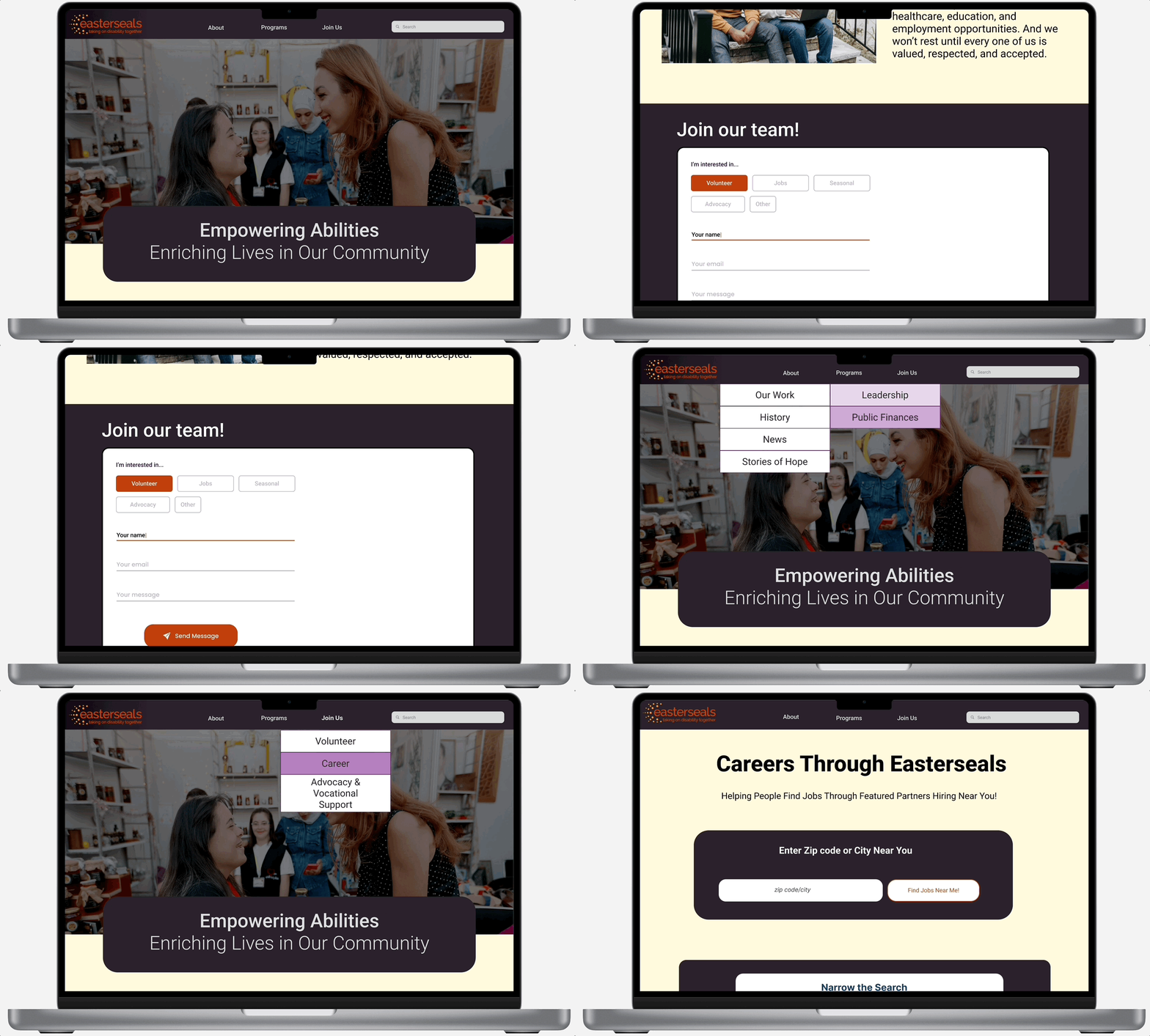
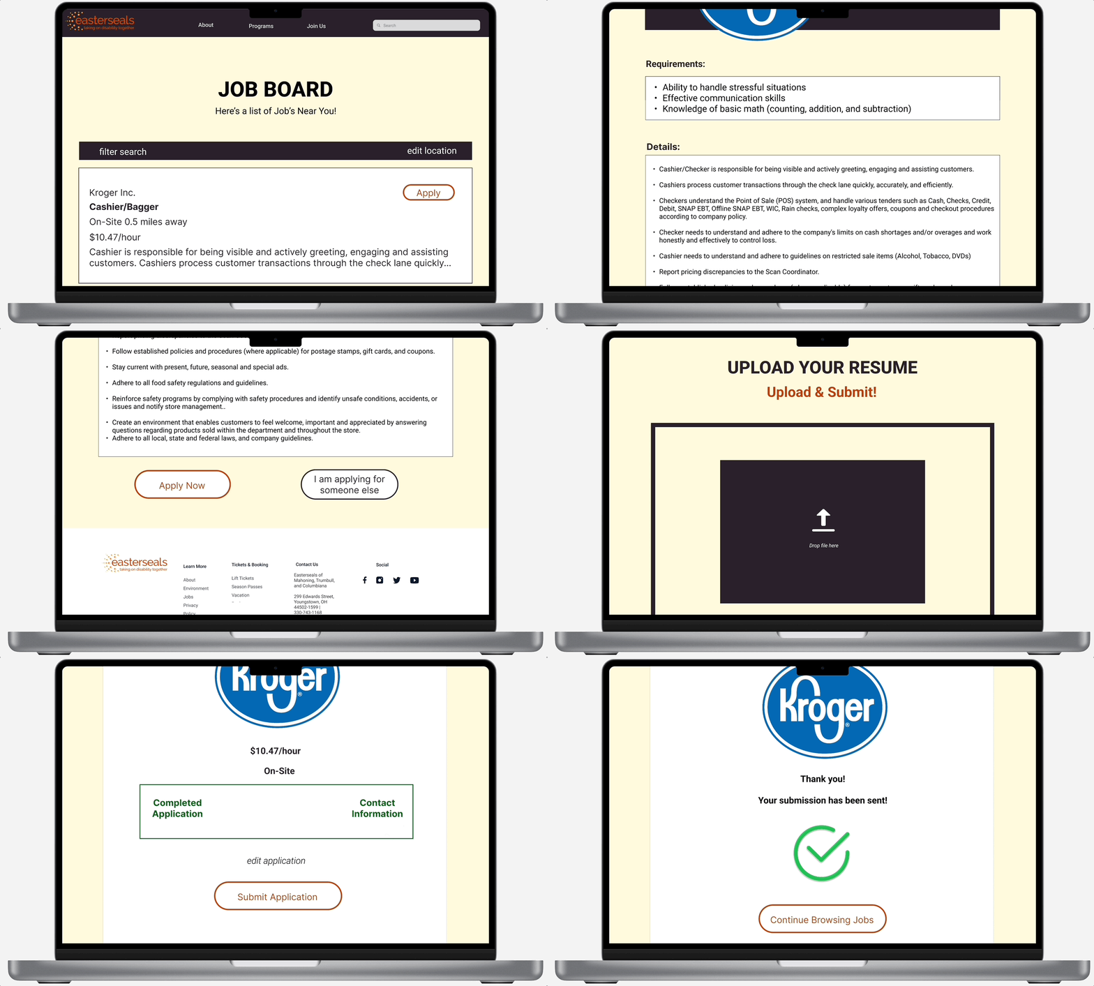
Mid-fidelity wireflow design for web browser
The Mid-fidelity prototype was created based off the second style guide. At this point, we finalized our features to a job form.
Feedback
Recieved feedback from our mid-fidelity design. Now it was time to iterate, iterate, and iterate which led to our final design.
Testing
We tested the prototype by having users navigate the job forms and submit application to evaluate ease of use and accessibility. Feedback will help refine the design for better functionality and user experience.
Original Site
The first test was conducted over the original Easter seals website where there was no job application forms. This made the users feel confused and frustrated.
Second test (High-fidelity Prototype)
First test (Mid-fidelity Prototype)
The second test on the mid-fidelity redesign revealed issues with unresponsive buttons, missing text boxes, and difficulty accessing the application form.
We simplified the navigation and job application process based on user feedback, fixing unresponsive buttons and confusing paths. Now, it’s easier for users to find and apply for jobs without any hassle.
Next steps
Future teams can improve the job application process by regularly getting user feedback to spot issues. Teams can make the steps clearer and more intuitive so users know exactly what to do next. Adding helpful tips along the way will keep applicants engaged. By staying connected with users and adapting to their needs, the application process can keep getting better and easier for everyone.
Learning 01: Importance of Early Testing
One key takeaway from this project was realizing the value of early testing. We didn’t catch certain issues, like unresponsive buttons and navigation problems, until later in the process, which caused delays. Had we incorporated more thorough testing of interactive elements earlier on, we could have avoided these setbacks. This experience highlighted how crucial it is to test prototypes with real users at each stage to ensure a smoother development process.
Learning 02: Collaboration is Key
Another important lesson was understanding the impact of team communication. At times, misalignment slowed us down, especially when feedback or ideas weren’t shared efficiently. Stronger collaboration, with more frequent check-ins and clearer communication, could have helped us tackle problems faster. This project reinforced that successful design isn’t just about individual contributions but also about how well the team works together.
Learning 03: Balancing Speed with Quality
Throughout the project, we often found ourselves racing against deadlines, which sometimes led to rushing through key steps, like testing and refining certain features. While speed is important, this experience taught us that sacrificing quality for the sake of meeting a timeline can result in more work later on. Finding the right balance between moving quickly and ensuring quality is critical to delivering a product that not only works but also provides a great user experience from the start.


